Interactive Sales Dashboard in Power BI
Main goal of this dschboard is to showcase all major Sales KPIs and to disect and filter data trough time, channel of sales,
product, product group, sales person and sales manager.
Dashboard is interactive in sence that when you hower over serten visualization you will get more related data. Also there
are buttons for filtering but also filtering can be done by clicing to any part of visualization and it will be applied to all
visualizations.
The first step was to familiarise my self whit data provided to see if data needed to be "cleand" (duplicat removal, formating...).
After that I needed to do proces of normalization and modeling of data.
Affter that I needed to create some calculated measures with DAX needed for visualizations, filters and ranking.

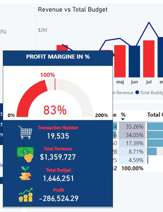
Also several interactive toltips needed to be created to show aditional info wich shows diferent data when you hover over
different parts of visualization.
You can see example below.

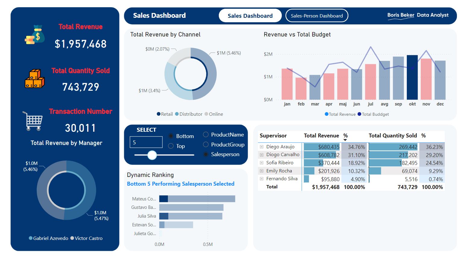
Filtering can be done by using filter buttons but also by clicing to any part of visualization.
On picture below I clicked on bar that represent Octobar and as you can see data on whole dasboard filtered to represent
just Octobar data.
Also you can see that I applied conditional formating so month that had negative profit are colored red.
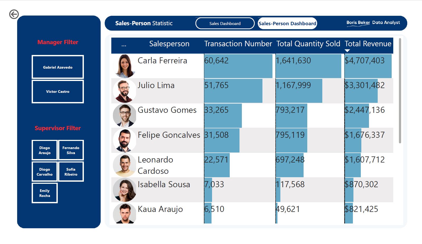
On the top of the dashboard there is button that lead to separete dashboard which shows data for individual sales person.